10 Logo Design Tips & How to Make a Good One (2024)

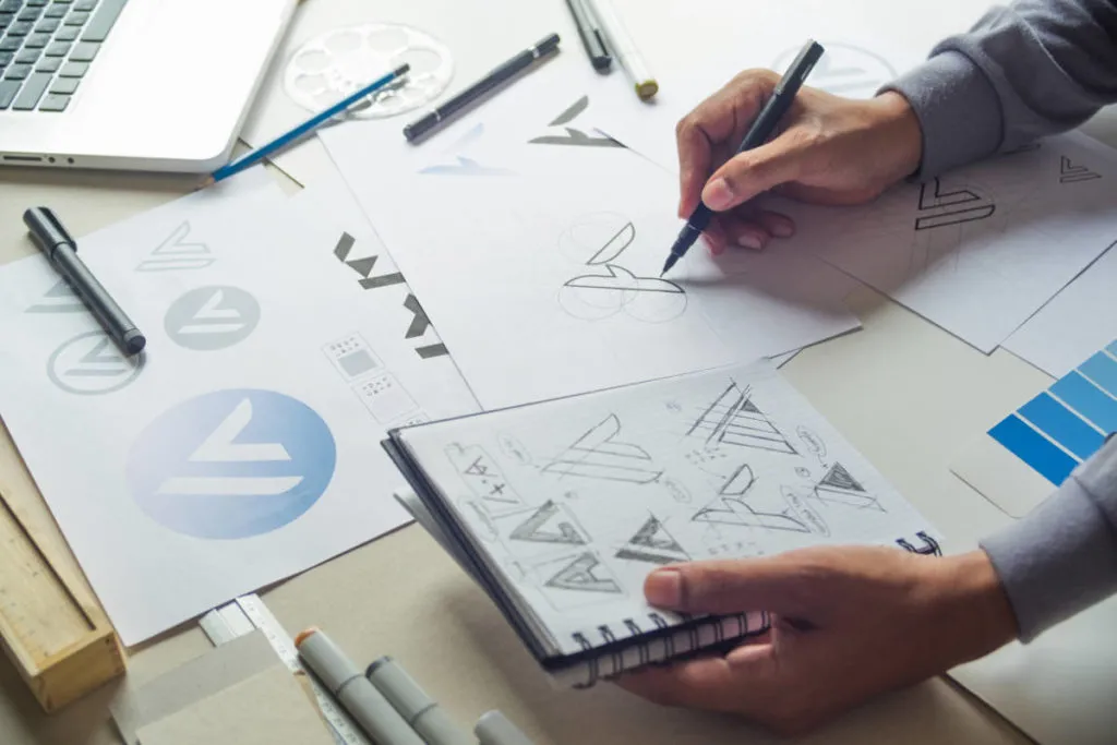
Logos are really important. They can be daunting to design but are a must for any business and are the cornerstone of any good business brand or even a personal brand.
You want your logo to explain who you are and what you do, why you do it and how you do it. You’ll include it on social posts, presentation decks, marketing materials, business cards and more. That’s a lot of heavy lifting for one little graphic to do, right?
Don’t worry, I’ve got you covered with a whole load of logo design tips, tricks and walkthroughs from an actual Graphic Designer (i.e. me) on designing a logo. Whether you’re a beginner or just in need of a refresh, follow these tips and tricks with the help of Venngage’s selection of logo templates to get started.
START CREATING FOR FREE
A good logo should:
Be eye catching
Be timeless
Be memorable
Work well large or small
Encompass your brand vibe
10 tips on how to make a good logo
A picture paints a thousand words
Use empty space to keep your logo design clean
Use shapes to think inside the box
Imagine your logo in situ
Color is key for good design
Be literal with your logo
Be authoritative with your logo
Create visual salience with a pop of color
Don’t reinvent the wheel when designing your logo
Don’t be afraid to rejig the wheel
Ready to get started? Check out our top 10 logo design tips and tricks below:
1. A picture paints a thousand words
Travel Tour Business Logo
EDIT THIS LOGO TEMPLATE
A logo is a visual representation of your brand, so why tell people what you do if you could just show them? Whether you hire a graphic designer or use a logo creator, be sure to use simple icons to communicate who you are.
Remember the brand vibe we talked about earlier? The use of the plane and the sun here makes me feel excited and reminds me of warm sunny holidays.
Ice Cream Shop Creative Logo template
EDIT THIS LOGO TEMPLATE
Visual puns are a designer’s best friend too – here Frost Bites have created a quirky ‘bite’ to show that they are a food company. This is really easily achieved by overlapping two circles that are the same color as the background.
Video Walk Through: How to personalize this logo
My imaginary Taco shop needs a new logo. I love the ‘bite’ design on the Frost Bites logo, but we sell delicious Mexican food – not ice cream!
So instead of a circle, I used a taco graphic. Watch how I did it below:
2. Use empty space to keep your logo design clean
Yoga Studio Creative Logo
EDIT THIS LOGO TEMPLATE
Coco Chanel once said, “Before you leave the house, look in the mirror and take one thing off”. The same thing applies to design.
You want to make sure people can read your logo from a distance, or when it’s really small – keeping it “clean” (designer speak for “lots of blank space”) will achieve this. Here we can see how Savant Yoga has utilized blank space to invoke a feeling of calmness.
Minimal Photography Creative Logo template
EDIT THIS LOGO TEMPLATE
This logo for a photography business takes minimalism to a new level, and creates a camera icon out of two brackets and the letter “o”. This logo proves that you don’t always need a whole bunch of colors or symbols to create a great logo.
Using blank space in your logo design is also helpful when it comes to brochure design, poster design, t-shirt printing, and plenty of other marketing collateral.
Also, minimalist logos are easier to integrate into smaller formats like business cards, personalized embroidery, labels, and many others.
3. Use shapes to think inside the box
Text Law Firm Business Logo
EDIT THIS LOGO TEMPLATE
Shapes are a really great way to make your logo stand out. For this logo for a law firm, we put the firm’s name inside boxes to achieve a professional look.
This also helps with cross-platform branding, as a “boxed in” logo works well digitally, as well on letterhead, presentations, and merchandise such as pens or lanyards.
FX-Technology-Company-Logo
EDIT THIS LOGO TEMPLATE
Shapes with interesting gradients or textures can be used to push your design to the next level. Here, FX Technology Co. has used a blue to yellow gradient to achieve a really sleek look. They’ve used a laptop icon inside the circle, but this could easily be changed to a bunch of flowers, a wine glass, or a stack of weights depending on your business.
4. Imagine your logo in situ
Coffee-Shop-Creative-Logo
EDIT THIS LOGO TEMPLATE
Boy, wouldn’t this logo look great on a coffee cup! When designing your logo try to make sure you think about its intended uses – are you looking to use it on a uniform, or will it just be for your website design? You can use a Mock Up Generator to see how your logo will look in situ.
Photography Creative Logo
EDIT THIS LOGO TEMPLATE
It’s also good to think about how you’re going to promote yourself when creating a logo. If you’re going to be doing a lot of networking, create a logo that looks good on business cards. This coral logo from Bird View Photography is arranged in a horizontal manner and would look great on a card.
5. Color is key for good logo design
Wellness-Spa-Creative-Logo
EDIT THIS LOGO TEMPLATE
Monochromatic doesn’t always mean black and white! Sometimes black and white can seem harsh on our eyes, especially if we’re trying to create a feeling of zen. You can use various shades of the same color to create subtle contrasts within your logo.
By using various shades of pink, Serenity has created a logo that is very calming – much like their spa must be. If you’ve been searching for the answer to, “what is good design?” well now you know.
6. Be literal with your logo
Production Creative Logo
EDIT THIS LOGO TEMPLATE
Your name is Electric Box Productions, huh? Have you considered…putting electricity inside a box? Sometimes it really is that easy.
If your name is a thing, make that thing your logo. Don’t be afraid to lean into the obvious, there’s a reason that Apple’s logo is, well, an apple.
Brewery logos are notorious for being literal, like this Cigar City Brewing logo:
Cigar-City-Logo-2018
Take note that some brands had to protect themselves from competitors infringing their registered trademark because the words in their logos weren’t translated into local languages or the logos literally depicted something that wasn’t translated.
For example, a South Africa-based Jordan Winery that was using an image of a chameleon on their sued one of the competitors, Lovane, for featuring the images of chameleons on their merchandise.
The problem was the word “uluvane” meant “chameleon” in one of the local languages in the country, which could potentially create associations between the two brands. The two brands spent quite a lot of time in court and paid thousands in legal fees, which could have been avoided had Jordan Winery used trademark translation to protect their brand.
Fun Modern Restaurant Logo Design
EDIT THIS LOGO TEMPLATE
Gold Spoon has been really clever with their logo design here, and has used their titular icon (the gold spoon) as a replacement for the letter “p”. This reminds me a lot of the hidden arrow in the FedEx logo and just goes to show that literally doesn’t mean boring.
fed-ex-logo-1
7. Be authoritative with your logo
French-Bakery-Creative-Logo
EDIT THIS LOGO TEMPLATE
Be literal, but make sure it fits your organization. Some companies, such as non-profits, demand a level of seriousness that a production company or ice cream shop can get away without.
Ask yourself: if I saw this logo for the first time, would I trust this company? Here Helping Hands have managed to create a logo that is both respectable but uses hands. Muted colors and serif fonts are key here, and stop the logo from feeling too cartoonish.
A font can go a long way to helping you create the right logo – luckily Venngage has a huge font library (we recently added 40 new fonts!) and we even have blog posts about font psychology to make sure you nail it.
Video Walk Through: How to personalize this logo
I like how this logo feels and think it really fits my brand vibe, but my organization is called “Head Start” not “Helping Hands”.
So instead of hands, I used arrows. Watch how I did it below:
8. Create visual salience with a pop of color
In our blog post “How to pick colors“ we explained how color is the most valuable tool in a designer’s toolbox, and it’s no different when making a logo.
In design, we call this “visual salience”. It’s a great term to use in casual conversation to impress your designer friends, and also a great way to create an impactful logo.
Venngage-Logo-Design-Tips-Use-a-Pop-of-Color
One easy way to create visual salience is to use a ‘pop’ of color.
Evergreen Business Logo
EDIT THIS LOGO TEMPLATE
In this Evergreen logo, the pop comes from a green leaf icon above the black text, but you could also make the first letter of your name a different color or even a whole word.
Adding this small pop of color stops your design from feeling flat, and is a trick designers use all of the time. The Amazon logo is a great example of this.
Amazon logo pop of color logo design tips
9. Don’t reinvent the wheel when designing your logo
French-Bakery-Creative-Logo
EDIT THIS LOGO TEMPLATE
If it works, it works. Sometimes, your bakery just needs a logo with wheat on it. If it feels right to you then go ahead and use it. Have a look at your competitors and see what their logos look like, are there any common themes or colors? Once you’re done reading these logo design tips, check out Venngage’s handy guide for creating a Competitor Analysis.
10. Don’t be afraid to rejig the wheel
Pepsi_Logos
Source
Pepsi has been around for 120+ years as a brand. The modern Pepsi logo we know is drastically different from how it had started. But the transformation from then to now was a gradual one. That’s because Pepsi was always building on the brand it had established, it wasn’t trading its old brand for a new and shiny one.
Besides, a drastic change would have been confusing for its consumers. People might not have recognized the Pepsi brand or product as easily, in stores or in advertisements.
It’s ok to be bold and try new things. Use patterns, overlapping shapes, and contrasting colors to create a modern logo. The “C” layered over the semi-circle helps elevate this design to the next level, and the contrasting blue and purple tell us that this company is bold and forward-thinking.
Geometric-Education-Creative-Logo
EDIT THIS LOGO TEMPLATE
Modernization doesn’t have to be ‘in your face’ to work. For this logo, Discovery Education chose to use an overlapping box effect. The subtle geometric pattern on the top box really helps to bring the logo right into 2019 – helping the brand feel fresh. Also, they have used a sans serif font which stops the logo from feeling stuffy and dated.
How to make a logo look professional?
Creating a professional logo involves a combination of design principles, creativity, and attention to detail. Here are some tips to help you make a logo look professional:
Simplicity: Keep the design simple and avoid overcomplicating it with too many elements or intricate details. A clean and simple logo is often more memorable and versatile.
Use appropriate colors: Choose a color palette that reflects your brand’s identity and conveys the right message. Stick to a limited number of colors to maintain a cohesive and professional look.
Baca juga:
6 Digital Marketing Trends to Watch in 2024
Scalability: Ensure that the logo looks good and remains recognizable at different sizes. Test the logo in various scales to make sure it is legible and clear, whether it’s on a business card, when you build a website or a billboard.
Typography: Select a font that complements the overall design and aligns with the brand’s personality. Avoid overly decorative or hard-to-read fonts and consider customizing the typography to create a unique identity.
Originality: Be original and stand out. No one wants to play “spot the difference” between your logo and your competitor’s. Avoid using clip art or stock images, as they can make the logo appear unprofessional and generic.
Consistency: Use the same colors, style and style across the board. Consistency is key, whether it’s for a website or a snazzy flyer.
Balance and proportion: Ensure that the logo is well-balanced and visually appealing. Pay attention to the proportions of different elements to create a harmonious composition.
Versatility: Design the logo in a way that it can be easily adapted across various mediums and platforms without losing its impact. A versatile logo will maintain its effectiveness whether it’s displayed on a digital screen, printed on merchandise or used in other marketing materials.
Research and feedback: Conduct thorough research on your target audience and industry trends to understand what resonates with your potential customers. Additionally, seek feedback from colleagues, clients, or focus groups to gain valuable insights and refine the design.
Professional design tool: Utilize a professional design tool like Venngage to create a high-quality, scalable logo. The easy-to-use drag-and-drop editor and gallery of free logo templates can be your secret sauce for making cool logos.
By following these tips, you can create a professional logo that effectively represents your brand and leaves a lasting impression on your target audience.
To recap our top logo design tips:
Venngage-Logo-Design-Tips
Share this graphic on Twitter
If you’ve ever worked with a designer professionally, you’ll know that they never just present one option. Try a couple of different logos and ask your friends, family, coworkers, and communities for their opinions as to which one feels right for your brand.
Check out Venngage’s full library of logo templates here.
The Venngage Business account comes with the ability to build a Brand Kit. You can upload your logos and company colors, and apply them to different templates with the click of a button.


